Harnessing Psychology in UX Design
This project explores the application of psychological principles to improve user experience (UX) design, specifically for Beaumont Hospital’s website. The objective was to reduce cognitive load and enhance visual appeal, making the site easier to navigate for users under stress.
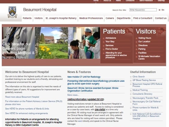
The Beaumont Hospital website has several usability issues:
Overwhelming information and visual clutter.
Inefficient chunking of information.
Poor color choices that do not induce calm or trust.
Aesthetic design flaws leading to a perception of lower usability.
Problems Identified
Research Methodology
The research methodology involved applying key psychological principles:
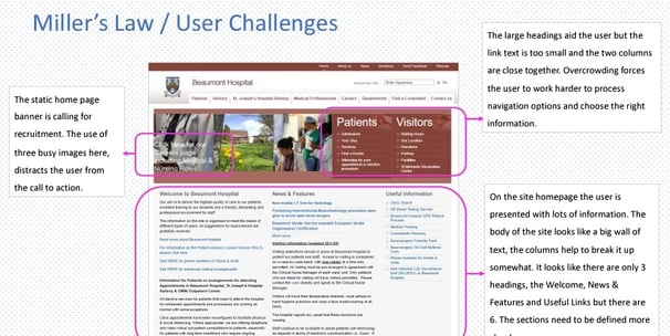
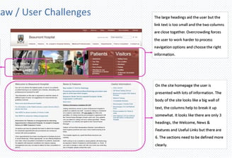
Miller’s Law: Limiting information to 7 (±2) items to reduce cognitive load.
Colour Psychology: Choosing colors that evoke calmness and trust.
Aesthetic-Usability Effect: Creating visually appealing designs perceived as more usable.
Key Research Findings
Miller’s Law: The website’s information overload and lack of clear chunking make it hard to navigate.
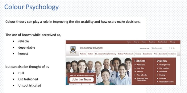
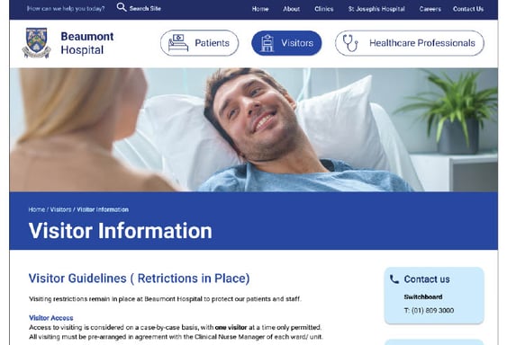
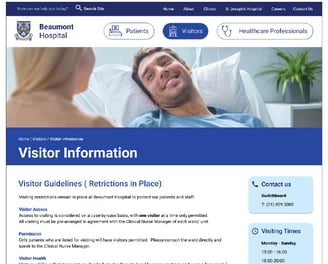
Colour Psychology: The current brown color scheme is not suitable for a hospital, as it can be perceived as dull and unsophisticated. Blue and white are preferred for their calming effects.
Aesthetic-Usability Effect: A visually pleasing design can enhance user experience by reducing cognitive effort and increasing tolerance for minor issues.
Target Audience
The primary users of the Beaumont Hospital website are:
Patients seeking medical information.
Visitors concerned about loved ones.
Medical professionals needing quick access to information. These users often experience pre-existing stress and anxiety, necessitating a design that minimizes cognitive load and enhances ease of use.
Research Goals and Objectives
The primary goals were to:
Reduce cognitive stress for users.
Improve ease of use with modern design patterns.
Make content quicker to digest.
Create a sense of calm and trust through design.
The proposed design improvements include:
Simplifying navigation to avoid clutter.
Using visual cues and larger text for better recognition.
Organizing information into digestible chunks.
Implementing a new color scheme (white and blue) to evoke calmness and reliability.
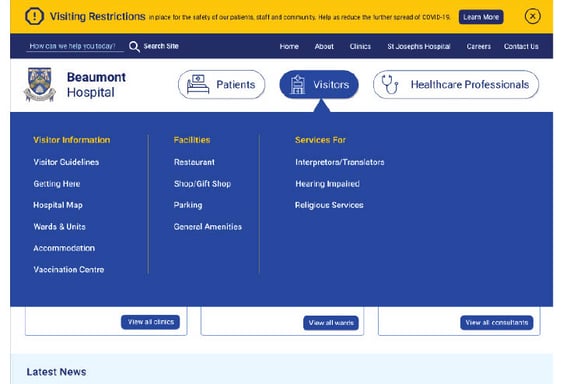
Designing a mega menu for structured, easy-to-scan navigation.
Design Solutions
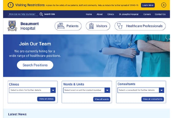
Prototype
The prototype design incorporates:
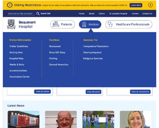
Chunking information into seven sections on the homepage.
Using visual clues and icons for better navigation.
Adding a mega menu for quick access to lower site levels.
Highlighting important visitor information prominently.
Reducing unnecessary actions and clutter to enhance user focus.
Conclusion
Applying psychological principles in UX design can significantly improve user experience, especially for users under stress. The redesigned Beaumont Hospital website aims to provide a more user-friendly and calming interface, ultimately helping users achieve their goals more effectively and efficiently.
© 2024. All rights reserved.